




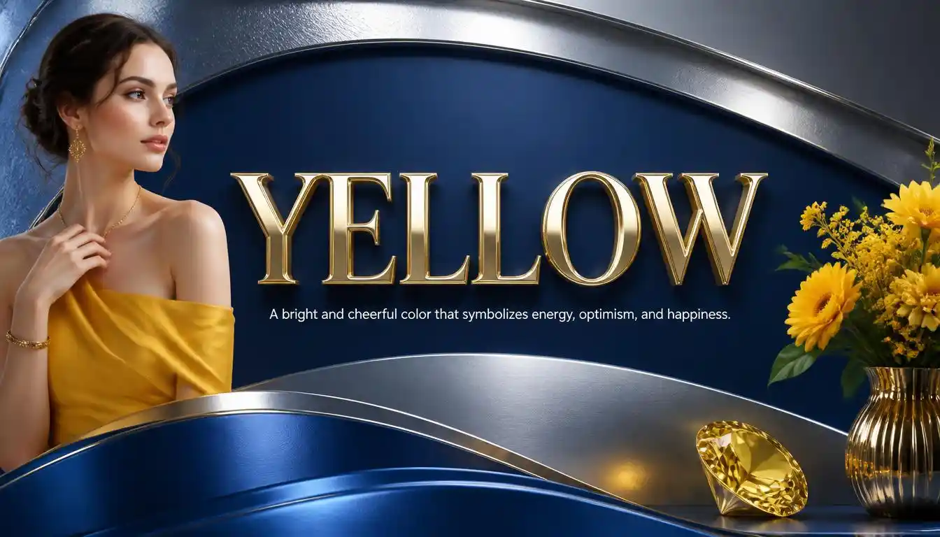
Looking for color names for yellow? Yellow is far more versatile than the basic bright shade most people picture first. From soft buttery tones and warm golden hues to earthy mustard shades and vivid neon yellows, this color family has an incredible range.
The right yellow can completely change the mood of a design. Pale yellows can feel gentle and airy, while rich golds bring warmth and elegance. Deeper ochre and mustard shades have a grounded, vintage character, and bright lemon tones can make a palette feel fresh and energetic.
Light and Soft Yellow Color Names
Soft yellows are gentle, welcoming, and easy on the eyes. They work particularly well when you want warmth without the intensity of a saturated yellow.
Buttercream
Color feel: Soft, creamy, and warm.
Best for: Cozy interiors, wedding designs, and elegant backgrounds.
Lemon Chiffon
Color feel: Very pale yellow with a delicate, creamy quality.
Best for: Light backgrounds and spring-inspired designs.
Vanilla
Color feel: A subtle yellow with a creamy off-white appearance.
Best for: Minimalist palettes and soft branding.
Primrose
Color feel: Fresh and lightly golden, inspired by the spring flower.
Best for: Floral designs and cheerful stationery.
Cornsilk
Color feel: Pale yellow with a warm, slightly beige undertone.
Best for: Backgrounds, packaging, and traditional designs.
Flax
Color feel: Muted yellow with a natural, slightly earthy character.
Best for: Rustic and neutral color palettes.
Cream
Color feel: A warm off-white carrying a gentle yellow undertone.
Best for: Interiors, fashion, and understated designs.
Champagne
Color feel: Light, sophisticated, and softly golden.
Best for: Luxury branding and celebratory graphics.
Daffodil
Color feel: Sunny yellow inspired by the familiar spring flower.
Best for: Floral themes and cheerful illustrations.
Lemon Cream
Color feel: A delicate blend of pale yellow and creamy white.
Best for: Soft lifestyle graphics and nursery designs.
Custard
Color feel: Richer than cream but still soft and mellow.
Best for: Food branding, kitchen décor, and nostalgic designs.
Banana Cream
Color feel: Gentle yellow with a warm creamy finish.
Best for: Playful designs that need a softer alternative to bright yellow.
Bright Yellow Color Names
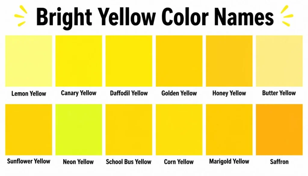
Bright yellows are energetic and attention-grabbing. They are useful when a design needs optimism, visibility, or a strong pop of color.
Canary Yellow
Color feel: Clear, vivid, and cheerful.
Best for: Eye-catching graphics and playful branding.
Lemon Yellow
Color feel: Bright yellow with a fresh, slightly crisp appearance.
Best for: Modern designs and energetic color palettes.
Sunflower
Color feel: Rich and cheerful with a warm floral character.
Best for: Nature-inspired artwork and summer themes.
School Bus Yellow
Color feel: Strong, unmistakable yellow with high visual impact.
Best for: Bold graphics and attention-focused designs.
Safety Yellow
Color feel: Highly visible, intense yellow designed to stand out.
Best for: Warning graphics, signs, and high-visibility applications.
Electric Yellow
Color feel: Extremely vivid and energetic.
Best for: Digital art, gaming graphics, and contemporary designs.
Cyber Yellow
Color feel: Bold, saturated yellow with a modern digital edge.
Best for: Technology-inspired branding and futuristic artwork.
Laser Lemon
Color feel: Extremely bright yellow with a fluorescent quality.
Best for: Neon artwork and high-energy visual projects.
Yellow Rose
Color feel: Clear floral yellow with a lively, fresh quality.
Best for: Romantic stationery and botanical designs.
Bumblebee
Color feel: Strong yellow with a slightly darker, warmer character.
Best for: Playful illustrations and nature-themed projects.
Saffron
Color feel: Rich yellow with noticeable orange warmth.
Best for: Food, cultural, fashion, and decorative designs.
Golden Yellow Color Names
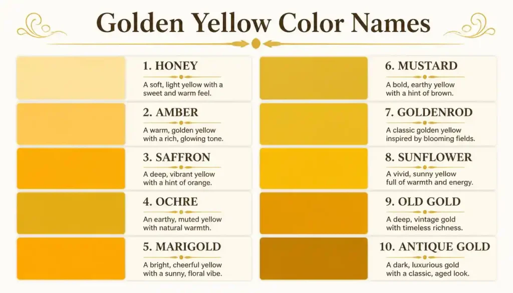
Golden yellows sit between yellow and orange or brown. They tend to feel richer, warmer, and more luxurious than ordinary yellow.
Gold
Color feel: Classic metallic-inspired yellow with a luxurious impression.
Best for: Elegant invitations, branding, and decorative accents.
Goldenrod
Color feel: Deep golden yellow with an earthy warmth.
Best for: Autumn palettes and traditional artwork.
Honey
Color feel: Warm, glowing yellow with amber-like depth.
Best for: Food packaging, cozy interiors, and natural branding.
Amber
Color feel: Golden yellow with an orange-brown undertone.
Best for: Jewelry-inspired designs and warm visual palettes.
Marigold
Color feel: Saturated yellow with a warm orange influence.
Best for: Floral artwork and autumn-inspired designs.
Harvest Gold
Color feel: Muted, warm gold associated with ripe fields and fall.
Best for: Vintage interiors and seasonal graphics.
Old Gold
Color feel: Darker and more subdued than bright gold.
Best for: Heritage branding, luxury designs, and vintage aesthetics.
Golden Poppy
Color feel: Vivid yellow with a warm orange cast.
Best for: Botanical artwork and bright summer palettes.
Indian Yellow
Color feel: Deep, warm yellow with a distinctive golden-orange character.
Best for: Painting, illustration, and artistic palettes.
Citrine
Color feel: Bright yellow with a gemstone-inspired richness.
Best for: Jewelry branding and sophisticated color combinations.
Maize
Color feel: Warm yellow resembling dried corn kernels.
Best for: Rustic artwork and harvest-inspired palettes.
Mustard
Color feel: Deep, earthy yellow with brown undertones.
Best for: Fashion, interiors, and retro-inspired designs.
Dijon
Color feel: A muted yellow-brown with a refined appearance.
Best for: Modern interiors and sophisticated fashion palettes.
Pastel Yellow Color Names
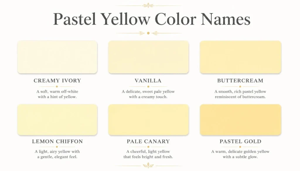
Pastel yellows are softer versions of the color. They can make a design feel calm, delicate, playful, or springlike without overwhelming the rest of the palette.
Pastel Yellow
Color feel: Light, gentle, and noticeably yellow without being intense.
Best for: Baby themes, stationery, and soft graphics.
Pale Yellow
Color feel: A simple, understated yellow with low visual intensity.
Best for: Clean backgrounds and minimalist designs.
Powder Yellow
Color feel: Soft and muted with a powdery appearance.
Best for: Fashion palettes and delicate illustrations.
Butter Yellow
Color feel: Warm, creamy, and pleasantly mellow.
Best for: Kitchens, interiors, and cozy lifestyle designs.
Soft Gold
Color feel: A restrained golden yellow with a polished appearance.
Best for: Elegant invitations and sophisticated branding.
Straw
Color feel: Light yellow with a dry, natural quality.
Best for: Rustic themes and organic packaging.
Sand Yellow
Color feel: A muted yellow influenced by sandy beige.
Best for: Natural palettes and earthy interiors.
Pale Maize
Color feel: Light, warm yellow with a subtle golden character.
Best for: Soft agricultural and nature-inspired artwork.
Light Khaki
Color feel: Yellow-green beige with a subdued appearance.
Best for: Neutral palettes and outdoor-inspired designs.
Creamy Yellow
Color feel: Warm yellow softened with a creamy quality.
Best for: Home décor and gentle backgrounds.
Orange-Yellow Color Names
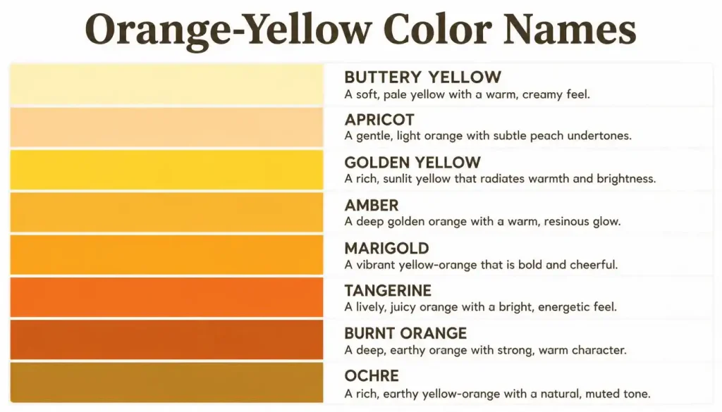
When yellow moves toward orange, it becomes warmer and more dramatic. These shades are especially useful for autumn, food, sunset, and tropical themes.
Tangerine Yellow
Color feel: Bright yellow with a noticeable orange influence.
Best for: Summer graphics and energetic branding.
Orange Peel
Color feel: Warm and vibrant with a strong orange-yellow character.
Best for: Food packaging and playful artwork.
Mustard Yellow
Color feel: Deep, earthy yellow with a vintage personality.
Best for: Clothing, interiors, and retro designs.
Curry
Color feel: Warm yellow with a spicy golden-orange character.
Best for: Food-related designs and rich cultural palettes.
Turmeric
Color feel: Intense golden yellow with orange warmth.
Best for: Food branding and bold decorative artwork.
Ochre
Color feel: Earthy yellow-brown with a natural, artistic quality.
Best for: Painting, ceramics, and rustic designs.
Yellow Orange
Color feel: A direct bridge between yellow and orange.
Best for: Bold palettes and expressive illustrations.
Apricot Yellow
Color feel: Warm yellow softened by a peachy orange influence.
Best for: Cheerful lifestyle designs.
Pumpkin Yellow
Color feel: Rich yellow-orange with a strong autumn character.
Best for: Fall graphics and seasonal décor.
Butterscotch
Color feel: Warm golden yellow with caramel-like depth.
Best for: Food branding and nostalgic designs.
Greenish Yellow Color Names
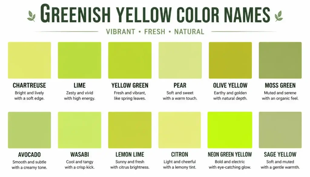
Yellow can also lean toward green, producing shades that feel fresh, acidic, botanical, or energetic.
Chartreuse
Color feel: A vivid yellow-green that feels modern and energetic.
Best for: Contemporary graphics and fashion.
Lime Yellow
Color feel: Bright yellow with a crisp green undertone.
Best for: Fresh, youthful designs.
Citron
Color feel: Bright yellow with a slightly greenish cast.
Best for: Modern palettes and citrus-inspired artwork.
Acid Yellow
Color feel: Extremely vivid yellow with a sharp green influence.
Best for: Experimental graphics and fashion.
Pear
Color feel: Yellow-green with a soft, natural fruit-inspired quality.
Best for: Food, botanical, and wellness branding.
Spring Bud
Color feel: Fresh yellow-green with a youthful spring character.
Best for: Nature-inspired artwork and seasonal designs.
Greenish Yellow
Color feel: Yellow clearly influenced by green.
Best for: Contemporary color studies and digital artwork.
Lime
Color feel: Vivid green-yellow with strong freshness.
Best for: Sports, food, gaming, and energetic designs.
Acid Green Yellow
Color feel: High-energy yellow-green with a fluorescent impression.
Best for: Neon graphics and bold visual projects.
Earthy Yellow Color Names
Earthy yellows are less saturated and more grounded. They pair beautifully with brown, olive, cream, terracotta, and other natural shades.
Ochre Yellow
Color feel: Warm, dusty, and naturally earthy.
Best for: Fine art and rustic interiors.
Earth Yellow
Color feel: Muted yellow with a grounded brown influence.
Best for: Natural color palettes.
Raw Sienna
Color feel: Earthy yellow-brown with a warm mineral quality.
Best for: Painting and traditional art.
Yellow Ochre
Color feel: Classic earthy yellow with a subdued appearance.
Best for: Art, ceramics, and historical-style palettes.
Desert Yellow
Color feel: Dry, warm yellow influenced by sandy landscapes.
Best for: Travel graphics and desert-inspired artwork.
Khaki Yellow
Color feel: Muted yellow with beige and green undertones.
Best for: Utility-inspired fashion and natural designs.
Antique Gold
Color feel: A subdued golden yellow with an aged appearance.
Best for: Vintage branding and ornate designs.
Bronze Yellow
Color feel: Darker yellow with brown and metallic warmth.
Best for: Decorative artwork and autumn palettes.
Tan Yellow
Color feel: Soft yellow blended with earthy beige.
Best for: Neutral interiors and understated designs.
Camel Yellow
Color feel: Warm yellow-brown reminiscent of camel-colored textiles.
Best for: Fashion and classic interior palettes.
Dark Yellow Color Names
Dark yellows have more depth and often contain brown, orange, or muted undertones. They can create a mature and sophisticated look.
Dark Goldenrod
Color feel: Deep golden yellow with a strong earthy quality.
Best for: Traditional artwork and rich autumn palettes.
Dark Mustard
Color feel: A deeper version of mustard with extra visual weight.
Best for: Vintage fashion and dramatic interiors.
Burnished Gold
Color feel: A darker, softened gold with an aged metallic impression.
Best for: Luxury and heritage-inspired designs.
Deep Saffron
Color feel: Saturated warm yellow leaning toward orange.
Best for: Rich decorative palettes.
Antique Yellow
Color feel: Muted yellow with a weathered, nostalgic quality.
Best for: Vintage graphics and historical themes.
Dark Ochre
Color feel: Deep earthy yellow-brown.
Best for: Painting and rustic design.
Golden Brown
Color feel: Brown warmed by a noticeable golden-yellow influence.
Best for: Autumn designs and cozy interiors.
Bronze
Color feel: Metallic brown-gold with a darker presence.
Best for: Decorative accents and sophisticated branding.
Unique and Creative Yellow Color Names
Sometimes you’re looking for something more distinctive than a standard color label. These descriptive names can help communicate a mood or visual concept.
Sunbeam
A bright, optimistic yellow inspired by a beam of sunlight.
Morning Glow
A gentle warm yellow that suggests early daylight.
Golden Hour
A rich, warm yellow inspired by the soft light around sunrise or sunset.
Honeycomb
A warm golden yellow with a natural, cozy personality.
Lemon Drop
A playful, cheerful yellow inspired by the classic candy.
Buttercup
A lively floral yellow with a friendly and youthful feel.
Sunlit Gold
A radiant golden tone that feels warm and polished.
Summer Wheat
A muted golden yellow with a dry, sun-warmed character.
Golden Meadow
A natural yellow inspired by fields filled with late-summer light.
Sunshine
A cheerful yellow associated with brightness and optimism.
Cornfield
A warm agricultural yellow with a natural seasonal feel.
Candlelight
A soft golden yellow reminiscent of warm indoor light.
Golden Sand
A sandy yellow with a subtle luxurious warmth.
Honey Glow
A mellow yellow with a soft amber-like character.
Solar Flare
A dramatic, energetic yellow inspired by intense sunlight.
Lemon Zest
A crisp, lively yellow with a fresh citrus personality.
Sunflower Gold
A saturated floral yellow with warm golden depth.
Golden Nectar
A rich, glowing yellow with a natural sweetness.
Desert Sun
A warm yellow influenced by dry landscapes and strong sunlight.
Warm Butter
A comforting yellow with a creamy, inviting feel.
Best Yellow Color Names by Mood
Choosing a yellow becomes easier when you start with the feeling you want to create.
| Mood | Yellow Color Ideas | Overall Feel |
| Cheerful | Canary Yellow, Sunshine, Daffodil | Bright and happy |
| Soft | Buttercream, Vanilla, Pale Yellow | Gentle and calm |
| Elegant | Gold, Champagne, Soft Gold | Refined and polished |
| Warm | Honey, Amber, Marigold | Cozy and inviting |
| Earthy | Ochre, Mustard, Raw Sienna | Natural and grounded |
| Energetic | Electric Yellow, Laser Lemon, Lime Yellow | Bold and lively |
| Vintage | Old Gold, Antique Yellow, Dijon | Nostalgic and sophisticated |
| Fresh | Lemon Yellow, Citron, Spring Bud | Crisp and youthful |
| Autumnal | Harvest Gold, Curry, Goldenrod | Warm and seasonal |
| Luxurious | Antique Gold, Burnished Gold, Citrine | Rich and decorative |
Best Color Names for Yellow
If you want a quick shortlist rather than a huge collection, these are some of the most versatile choices:
- Gold — classic and luxurious
- Lemon Yellow — fresh and lively
- Mustard — earthy and fashionable
- Honey — warm and welcoming
- Canary Yellow — bright and cheerful
- Saffron — rich and warm
- Buttercream — soft and creamy
- Goldenrod — deep and natural
- Daffodil — floral and sunny
- Ochre — artistic and earthy
- Champagne — subtle and elegant
- Sunflower — vibrant and optimistic
- Amber — golden with orange warmth
- Chartreuse — vivid yellow-green
- Marigold — warm and decorative
How to Choose the Right Yellow
The best yellow depends less on the name and more on the mood, surrounding colors, and purpose of your design.
Consider the Temperature
Warm yellows contain noticeable orange, gold, or brown influences. They tend to feel cozy and inviting.
Cooler yellows may lean slightly toward green and can feel fresher and more energetic.
Think About Saturation
A highly saturated yellow immediately grabs attention. That’s useful for buttons, signs, illustrations, and statement pieces.
A muted yellow is easier to live with and often works better as a background or supporting color.
Look at the Lighting
A yellow that looks soft on your screen can appear much brighter in natural light. If you’re selecting paint or fabric, test a sample in the actual space before committing.
Check the Colors Around It
Yellow can look completely different depending on what surrounds it. Pairing it with navy can create a sophisticated contrast, while white gives it a clean and airy appearance. Brown and beige make yellow feel warmer and more natural.
Match the Mood
Ask yourself what you want people to feel when they see the color.
A energy, choose a vivid lemon or electric yellow. The warmth, explore honey or amber. For a relaxed look, try buttercream or pale yellow. For a vintage feel, mustard and old gold are strong choices.
Yellow Color Combinations
Yellow rarely has to work alone. The right companion color can make its personality much clearer.
Yellow and Navy
This combination creates strong contrast while still feeling polished. It’s particularly useful for branding, websites, and editorial designs.
Yellow and White
White makes yellow feel lighter, cleaner, and brighter. This is an easy combination for minimalist designs.
Yellow and Black
Black gives yellow maximum visual contrast. The result can feel bold, modern, and attention-grabbing.
Yellow and Green
Yellow paired with green creates a fresh, botanical impression. Lime and chartreuse work especially well with natural greens.
Yellow and Brown
Brown grounds yellow and gives the palette a warm, earthy quality. This pairing is excellent for autumn and rustic themes.
Yellow and Gray
Gray tones down yellow and creates a more sophisticated balance. This can work particularly well in contemporary interiors and websites.
Popular vs. Unique Yellow Color Names
There’s a useful difference between a popular color name and a unique color name.
Common names such as yellow, gold, lemon, mustard, and amber are immediately understandable. They’re useful when clarity matters because most people already have a general idea of what they look like.
More creative names such as Sunbeam, Morning Glow, Golden Meadow, or Lemon Zest are better when you’re trying to create an emotional identity around a palette.
If you’re naming colors for a brand, design system, art collection, or product line, consider choosing names that are memorable but still give the reader some visual clue about the shade.
Frequently Asked Questions About Color Names for Yellow
What are the most common names for yellow?
Some widely recognized yellow color names include lemon yellow, canary yellow, gold, mustard, amber, saffron, goldenrod, sunflower, ochre, and daffodil. The exact appearance can vary depending on the color system, material, lighting, and digital display.
What is a soft shade of yellow called?
Soft yellows can be described as pale yellow, buttercream, vanilla, lemon chiffon, pastel yellow, cream, or butter yellow. These shades usually have lower saturation and create a gentler appearance than bright primary yellow.
What is a dark shade of yellow called?
Dark or muted yellows include mustard, ochre, dark goldenrod, old gold, antique yellow, harvest gold, and golden brown. Many darker yellows contain brown or orange undertones, which gives them greater depth.
What is a yellow-orange color called?
Yellow-orange is often described using names such as saffron, marigold, curry, turmeric, golden poppy, or orange peel. These colors sit between yellow and orange and generally have a warmer appearance than lemon or canary yellow.
What yellow color is best for a website?
There isn’t one universally best yellow for a website. Bright yellows work well as accents, while pale yellows can serve as backgrounds. For readable text, always check contrast rather than choosing a shade based only on appearance.
What colors look good with yellow?
Yellow pairs well with many colors, including navy, white, black, gray, brown, green, purple, and blue. The best combination depends on the particular yellow. A muted mustard, for example, creates a very different effect with navy than a bright lemon yellow does.
Is gold considered a shade of yellow?
Gold is closely related to yellow but is usually treated as its own color family because it often has warmer orange or brown undertones and may also refer to a metallic appearance. In everyday design language, gold is commonly included among yellow-related colors.
How many different yellow colors are there?
There is no single official number of yellow shades. Color systems can define thousands or millions of distinguishable colors, and designers often create additional names for specific hues, tones, tints, and shades.
Conclusion
Yellow is much more than one bright primary color. It can be creamy and delicate, sharp and electric, rich and golden, earthy and muted, or fresh with a hint of green. That range is what makes yellow such a useful color family for design.
When choosing among color names for yellow, focus on the actual feeling and appearance you need rather than choosing a name simply because it sounds appealing. Consider brightness, saturation, undertones, lighting, and the colors that will sit beside it.
A pale buttercream may be the right choice for a calm background, while saffron could bring warmth to a rich palette. If you want something bold, electric yellow can make an immediate statement. For a more grounded look, mustard or ochre may be a better fit.

I’m Shahid Imran, the creator of Reachora Media, a website dedicated to names, their meanings, origins, pronunciations, and interesting name-related information. Explore my website to discover meaningful and unique names with helpful, easy-to-understand details: Reachora Media